Everyone, and I mean everyone, judges books by their cover. We’re supposed to. Book covers communicate genre and audience instantaneously. They communicate comp(arison) titles. They are part of an author’s contract with the reader and set appropriate expectations for their time and attention. Covers speak. “Read this story, dear reader, and you will be entertained in all the ways you’d expect for a book with a cover like this.”
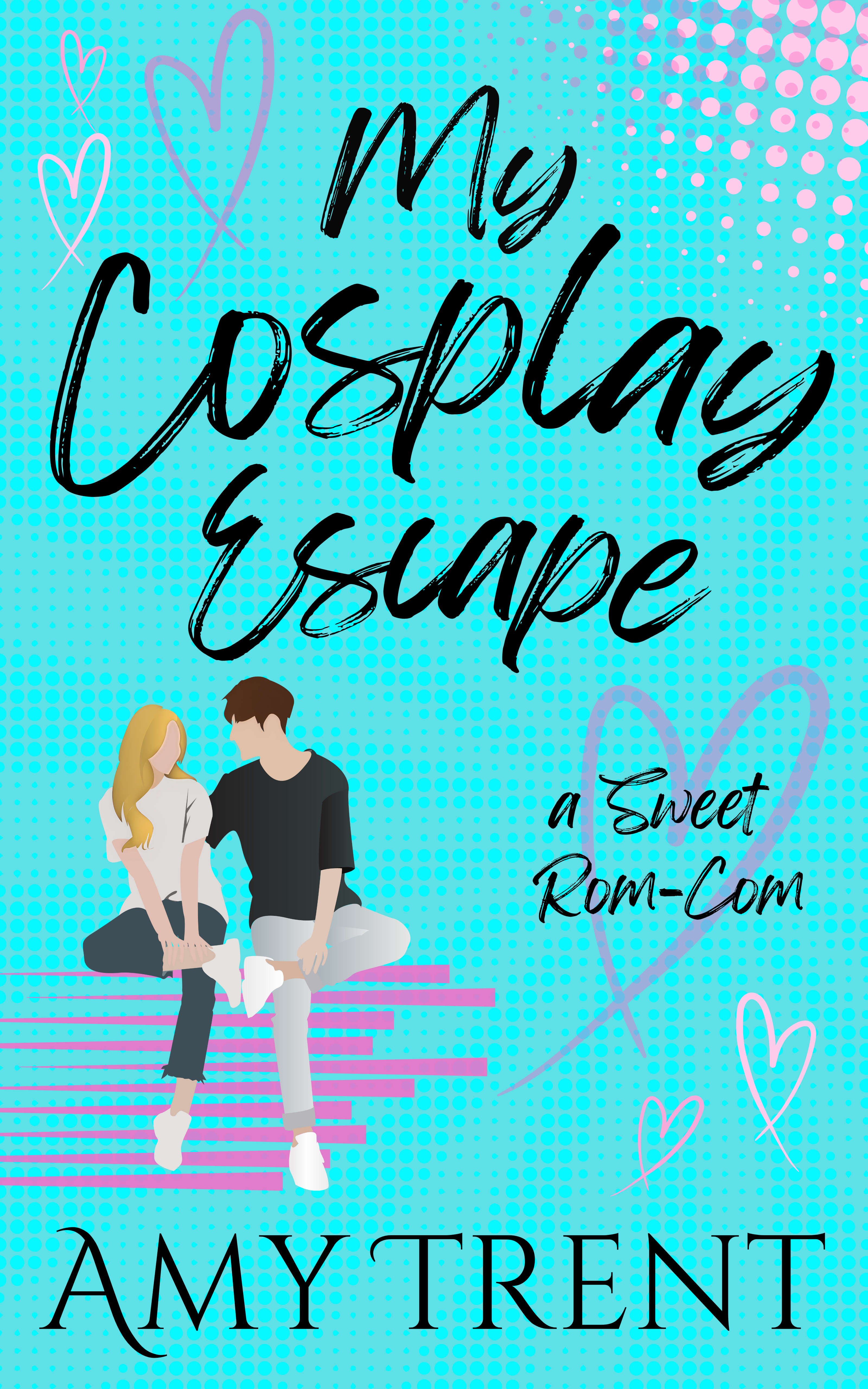
This weekend I made a new cover for my rom-com, My Cosplay Escape. As an indie author I get the final say when it comes to the covers of my book. But as an Indie author, I don’t always know what I’m doing. My Cosplay Escape was the first book I ever published. Doing so was a learning experience with a steep learning curve. There were dreams I had for my book, and then there was the reality of my limited budget and time. I did research, I looked at comp titles. I noticed that all contemporary rom-coms had illustrated covers with the romantic couple on the front. I found an exceptionally talented cover artists, and she created a cover that was super fun and super unique and did all the things I asked: vibe comics, include my heroine and hero, be playful.

She nailed it and created a super unique cover. But super unique isn’t always a good thing in the publishing world. Super unique means readers don’t instantly know where to place the story in their understanding of genre and audience. But there’s more at play here. As I keep writing and keep honing in on what my values are as a writer, it’s easier to see how my original cover for My Cosplay Escape is a little at odds with my brand. Whimsical, light, cozy, happily-ever-afters are what I write even when I’m writing contemporary fiction, and none of that comes across in loud primary colors, sharp black benday dots, and bold outlines.
I needed a new cover for my book, one that jives better with the multiverse I’m creating. I also need to resize my book, but that’s a story for another day (and requires formatting software that I don’t yet have so, I’m sticking with the 6″ x 9″ size for now). I needed a new cover yesterday on a shoe string budget, because I already spent hundreds and hundreds and hundreds of dollars on the first cover (I know. I know. Sunk costs, but tell that to my bottom line). Could I DIY a new cover? I don’t have photoshop, but I have spent a lot of time on Canva as of late. Is it even possible?
Yeah, it totally is. I watched this tutorial to get me started:
It was super helpful and led to an ebook cover that I put together Friday night as Mr. Trent, beloved offspring, and I watched a Tom Cruise movie. Beloved offspring wants to watch “scarier” movies as of late. And Tom Cruise plus aliens fit the bill. Anyway here is the new ebook cover compared to the old ebook cover:

New cover.

Old cover.
There is still a comic vibe to the new cover, but the colors, fonts, and elements are all lighter, softer, and fit better with my brand and the genre of sweet/closed-door contemporary rom-coms. Success! But this ebook cover was only half the battle, because I also needed the cover flat, which is the single image that is printed and used to cover/bind a paperback book. I made one cover in Canva; could I make another? Another YouTube tutorial later (see below), I decide the answer to that question was yes.
The size of a cover flat is dependent on the thickness of the book. Exact page counts are needed so you know what size to make the pdf, and I was happy to learn that there is a KDP cover calculator that demystifies this whole process.
https://kdp.amazon.com/cover-calculator
Once I had generated a template, creating a custom design with the appropriate dimensions was easy. So was using (and locking) the guides in Canva. On Saturday I made this:

And my author buddy plus family said it needed to be put into production immediately. So I made the changes that afternoon. A rare moment of instant gratification in my author journey.
So concludes my tale of two covers, for now at least. I do need to update the size of my book, which will happen when I finally get around to acquiring Atticus this fall. But what do you think? Do you like the new cover better? What do you look for in covers? You can send me a line anytime by using my contact form or by emailing me (amy at amytrent.com).


